Skinluxe
Skinluxe are and Australian online skincare retailer
Core Values: Trust, expertise, curated skincare backed by science
Branding Concept:
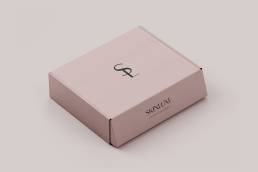
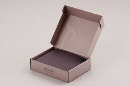
The logo for Skinluxe is designed to embody a modern and sleek appearance that effectively conveys both trust and expertise. It balances professionalism with approachability, creating a brand identity that resonates with customers seeking high-quality skincare products and advice.
Key Elements:
– Modern & Sleek Design: Clean lines and minimalistic elements are used to create a polished and sophisticated look that appeals to contemporary consumers.
– Timeless typography and colour scheme that ‘stands the test of time’.
Branding:
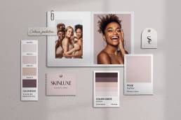
– Colour Harmony:
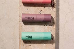
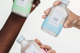
The colour palette includes shades that represent various skin tones, emphasising inclusivity and celebrating diversity.
– Soft & Approachable:
Design Element: Soft, muted tones are chosen to create a warm and inviting atmosphere, ensuring the brand does not appear too clinical.
– Impact: These colours make the brand approachable and relatable, helping customers feel at ease.
– Timelessness:
The colour scheme is selected to remain timeless, avoiding overly trendy shades that might become dated.
Timeless colours ensure the brand maintains its relevance and appeal over the long term.
Conclusion:
The branding for Skinluxe is created using a modern and sleek appearance, effectively communicating professionalism and reliability while remaining welcoming and friendly. The inclusive and timeless colour palette further strengthens the brand’s identity, making Skinluxe a comforting and inviting experience for customers. This balanced design not only aligns with Skinluxe’s brand identity but also creates a lasting connection with customers, encouraging them to explore the range of high-quality skincare products and expert advice offered by the brand.
ClientSkinluxeServicesWebsite Design & Development (eComm) | Logo Design | Brand IdentityYear2019
