Core Values: Holistic wellness, nutrition, and sustainability
Concept:
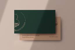
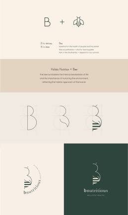
The logo is designed to encapsulate the essence of holistic nutrition centred around whole foods and natural alternatives. The concept revolves around the symbolic use of the letter “B” and the image of a bee, integrating elements that represent the core principles of bnutritious.
Key Elements
- Letter B:
Significance: The “B” stands for both Britney, the founder of bnutritious, and the bee, a symbol of hard work, community, and essential environmental roles.
Design: The letter “B” creates a strong visual connection to the brand name and its founder. - Bee Imagery:
Symbolism:
– Health and Planet: Bees are vital to the health of both people and the planet, playing a crucial role in pollination and the production of food.
– Food Security: Their role as pollinators makes them essential for maintaining food supplies and biodiversity, which are fundamental to human survival.Concept: The bee symbolises the interconnectedness of life and the importance of nurturing the environment, reflecting the holistic approach of the brand.
- Leaf as Wing:
Design Element: The bee’s wing is creatively depicted as a leaf.
Symbolism: Emphasises the plant-based, holistic wellness aspect of B Nutritious, integrating the idea of natural, sustainable nutrition.
Wholeness & Biodiversity: The leaf-wing symbolises the holistic nature of the brand, embodying the idea of bringing everything together to promote overall well-being.
Integration of Concept
Holistic and Biodiversity: The logo seamlessly combines the concepts of biodiversity and holistic wellness, representing the idea of wholeness and the interconnectedness of all living things. This integration embodies the brand’s mission to support comprehensive health and sustainability.
Outcome
The final logo is a thoughtful representation of the brand’s values and mission. By incorporating the letter “B,” the bee imagery, and the leaf-wing, the logo effectively communicates the holistic and sustainable focus of the brand, while honouring the vital role of bees in our ecosystem. This cohesive design not only aligns with the brand’s identity but also serves as a visual reminder of the importance of nurturing both personal health and the health of the planet.

