Scope: Packaging design for a range of powdered hot drinks
The Haus of Health is a brand that’s grassroots, a little grungy, and proudly alternative. They’re all about real, natural ingredients with no additives—nothing but the good stuff. When tasked with creating packaging for their new range of powdered hot drinks, the goal was to break away from the typical, often subdued, look of natural and organic products. The result? A design that’s as bold and vibrant as the flavours inside.
Design Concept: Spice Heroes
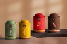
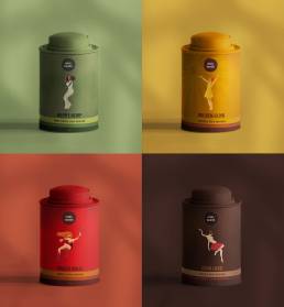
The theme for this packaging was ‘Spice Heroes,’ with each blend represented by a dynamic, illustrated character. The characters are lively, fun, and full of personality, embodying the bold flavours and the brand’s spirit. The styling is playful and fun with each hero bringing their unique vibe to the table.
Packaging Styling
In line with The Haus of Health’s mission to stand out, the packaging is colourful and eye-catching, steering away from the muted tones often associated with natural products. Using vibrant and quirky reflects the brand’s belief that natural can still be fun. Using bright, bold colours and dynamic illustrations set these products apart on the shelf, making them not just a drink, but an experience.
The result is packaging that speaks to the brand’s grungy, grassroots ethos while also appealing to consumers looking for something different in their everyday cup. It’s natural, it’s fun, and it’s anything but ordinary.

