Scope: Packaging design for a food toppers range
The Haus of Health is all about keeping things real—no frills, no additives, just pure, natural goodness with a bit of edge. For their food toppers range, they wanted packaging that would stand out from the crowd and still feel true to their grassroots, slightly grungy vibe.
Design Concept
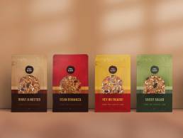
The brief was clear: keep it natural, keep it fun, and make sure it’s something that jumps off the shelf. The goal was to create packaging that’s bursting with life, using vibrant colours that tie back to their Spice Heroes range. We stayed true to that grassroots, alternative vibe while giving each blend a distinctive personality.
Packaging Styling: A Slice of Sunset
One of the standout features of this design is the rounded cut-out window. It’s not just there to show off the food toppers—it’s designed to look like a sunset on the horizon—a touch of natural beauty that’s right on brand, right in the middle of your pantry.
The Result
The Haus of Health’s food toppers range packaging is a perfect reflection of the brand’s down-to-earth, no-nonsense approach. It’s bold, it’s fun, and it’s got personality to spare—just like the folks who will be enjoying it. By mixing natural ingredients with a playful, eye-catching design, we’ve made sure these products are a treat for the eyes and the taste buds.


