The Brief
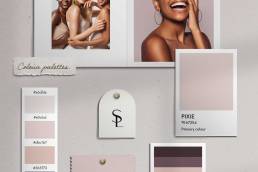
The goal was to create a logo that is elegant, strong, and sophisticated—one that resonates with businesswomen and entrepreneurs. It was important to move away from the idea that female leadership is symbolised by a high heel, which can feel limiting and outdated. The challenge was to retain the essence of their past, while giving the brand a fresh, modern, and high-end look.
The Solution
We reimagined the name to LH Agenda, keeping the “L” for Leaders and the “H” for Heels, but shedding the imagery that felt stereotypical. The new name is sleek and forward-thinking, maintaining a nod to the brand’s origins while pushing it into a more refined and bold space.
The Result
The rebrand successfully modernises LH Agenda, positioning it as a refined and empowering brand for women in business. By moving away from the imagery of heels, LH Agenda is now positioned to connect with a broader audience of female entrepreneurs.


