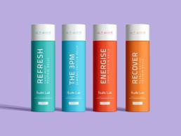
Scope: The project involved conceptualising and designing packaging for Health Lab’s initial product offerings: 5-pack protein ball packs and protein powders. This project marked the early days of Health Lab, laying the foundation for their now-expanded and evolved range.
Key Considerations:
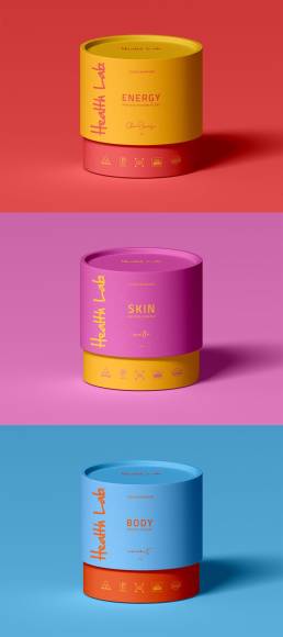
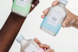
- Bright Colouring & Product-Specific Colors:
- Energise: Utilised orange tones to reflect vitality and energy.
- Skin: Employed pinks to symbolise care and rejuvenation.
- Body: Incorporated blues to convey calmness and strength.
- Early Brand Development:
- Designed packaging that would stand out in the market and establish Health Lab’s identity.
- Ensured that the packaging was not only eye-catching but also reflective of the brand’s commitment to health and wellness.
Design Concept: The design aimed to create vibrant and engaging packaging that would attract consumers and communicate the benefits of each product. The colour schemes were chosen to align with the intended effects of the products, enhancing brand recognition and appeal.
Outcome: The packaging designs helped establish Health Lab’s brand presence in the market during its early stages. Targeting regular gym-goers and supplement stores, the use of bright, product-specific colours made the products stand out on shelves and helped in building initial brand recognition.

