Scope: Branding Identity
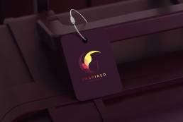
When creating the brand for Inspired Tours + Events, the goal was clear—something that feels unique, upscale, and connects with an audience that values curated, one-of-a-kind experiences. The idea behind the design? A simple yet powerful bird symbol that ties together the unity, freedom and exploration that travel brings.
The bird
The bird, shaped in a circle, is more than just a visual element. It symbolises freedom, travel, and seeing the world from a different perspective—much like the exclusive tours Inspired delivers. The circular shape represents completeness, a nod to the seamless, well-rounded experiences customers can expect.
Colour pallete
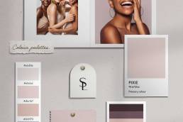
The colours play a big role in bringing the brand to life. Deep burgundy, vibrant reds, and soft touches of gold were chosen to evoke a sense of elegance and luxury. Burgundy adds that rich, refined feel, the reds bring a pop of energy and passion, while the gold represents the premium, high-end experiences the company is known for.
The result
The final look perfectly captures the essence of Inspired Tours + Events—luxury, exploration, and creativity wrapped in one. It’s a brand that is visually striking but also tells a story of freedom and adventure, making it feel as special as the tours themselves.


